10 Golden Design Rules to Make Your Email Shine (and Convert!)


As our inboxes become more and more crowded, it’s your responsibility as a genius marketer to stand out above the rest. Email marketing without the right strategy leads to a lot of work without a lot of payoff, and the design of your email is one of the key ingredients in a successful strategy. Behold: the ten golden rules of email design that will set you on the path to inbox glory.
Layout and Coding
1. Use One Column (Most of the Time)
For the majority of emails, a simple single-column layout is optimal. It makes it much easier for the user to read and navigate, and it doesn’t overwhelm the user right off the bat with two (or more) walls of text. If you have a hefty amount of info to place in an email, embrace the scroll.
One column of content is also ideal for viewing on mobile devices, which is a crucial factor to consider now that over 60% of email opens occur on phones and tablets. Designing for mobile is no longer simply an option—it’s a necessity. Take a whack at designing your emails for mobile first, rather than designing for desktop and revamping for smaller devices. This approach is particularly helpful for straightforward emails like purchase confirmations, account updates, and promotional announcements.
2. Abide by the Magic Width Number
Keep your email’s maximum width at or close to 600px. This width is ideal in providing plenty of space in the majority of web and desktop email clients without going overboard. (Too-wide emails can cause issues in many clients, like having to scroll to the right to read the entire message or hit the “reply” button.) You can use media queries to fine-tune the layout size for mobile devices.
3. Avoid Complex Coding
Email clients do not support Javascript and Flash at all, so those are both big no-no’s. Newer code, like HTML5 and CSS3, is supported in some clients and can offer some extra functionality, but use code like that with caution (i.e. test, test, test before sending!). Also, bear in mind that advanced code typically adds size to an email, and you’ll want to aim to keep your email size below 100kb. Large emails are more likely to get blocked by spam filters or get “clipped” by Gmail.
Fonts and Copy
4. Select Clear, Easy-to-Read Fonts
The use of web-specific fonts is best practice for email marketing, but it’s important to note that these fonts are not necessarily supported by all email clients. If the email client doesn’t support a specific font, it will substitute a fallback font, typically Helvetica, Arial, or Times New Roman. Remember to always set a fallback font if you’re using a custom font, and ensure this fallback font is “web safe” (rather than a system font that is only supported on hard devices, like Calibri).
5. Use All-Text Emails Occasionally for Authenticity
While image-based emails are generally more effective than their plain text counterparts for the majority of promotional campaigns, certain instances lend themselves better to a good old text-only message. Plain text emails give off a greater sense of authenticity (like getting an email from your coworker)—plus they are significantly easier and quicker to create. A smart way to integrate all-text emails into your marketing efforts is to mix it up: send image-heavy emails for product or promotional emails, and send text-only emails to communicate things like company updates to build a sort of relationship with the lead.

6. Harness the Power of Preview Text
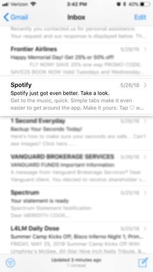
The preview text, or preheader, is the little snippet of copy that’s visible in the preview portion of the user’s inbox. It’s the first thing the user reads before opening your email and can determine whether they even follow through with opening it or not. And with the rise in email opens on mobile devices, the preheader is all the more valuable. Tips for this crucial little nugget: keep it short (somewhere in the 30-80 character range) and direct, and ensure it flows well with the subject line. Think of it as a single line of advertising that will without a doubt reach your recipient, regardless of whether they open it or not.
7. Try Using Emojis—Thoughtfully 🤔
The humble emoji. It adds charm, context, and a punch of fun to your otherwise plain emails. And use of them in subject lines been reported to boost open rates by grabbing the recipient’s attention. However, this doesn’t mean it’s time to go buck wild with ALL the emojis. 💥😜🍕
Use these symbols with purpose; don’t just toss in a 💩if it doesn’t make sense. Consider your audience as well. The last major point to keep in mind is that if an email client does not support emojis, the recipient may see a "☐" character in its place, so it’s typically best to avoid replacing whole words with symbols.
Images and CTAs
8. Use Buttons for CTAs, Not In-Line Links
Clicking on a teeny little line of text with your finger can be tough. As mobile continues to dominate, avoid using in-line hyperlinks for calls-to-action within your emails. They’re harder to see and to press than larger, clearer buttons. To craft the perfect CTA button, start with the copy and the design, ensuring that the messaging is specific and focuses directly on the end gain for the user. Design-wise, utilize colors, fonts and imagery (if possible) that align with your brand aesthetic and stand out. A size of at least 60px by 60px is optimal for tapping on a phone. Once it’s ready to place in your campaign, select a spot within the email that has plenty of white space surrounding it and allows room for the appropriate amount of contextual copy either before or after it. For example, if you’re trying to convince the recipient to register for a webinar, first explain what the webinar is about, who’s leading it, so on and so forth, and then place the CTA below that. Use your common sense.
9. Try Videos or GIFs the Smart Way
Yet another way to make your email stand out from the rest, the addition of video is increasingly becoming more popular. It’s more engaging than a static image, and can even boost your click-through rate by 96%, according to a Wordstream report. Unfortunately, several mainstream email clients like Gmail and Outlook don’t support the ability to play video inside an email.

Your alternative? Either embed the video (supported by over half of email clients via HTML5 compatibility) or use an animated GIF instead.
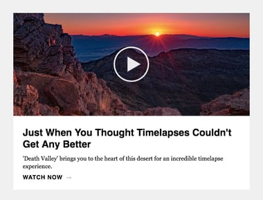
Or to pack an extra punch to your click-through-rate, insert a static freezeframe of your video with a play button (shown here).
Decided you want to use a GIF? Keep the file size as small as possible (around 1MB max!) by reducing unnecessary animation, frames, and colors.
10. Select Images for the Mobile Experience First
This is the most foolproof way to ensure that your images look pixel perfect on phones and tablets, which is particularly important when using images with overlaid text. See how in the screenshot below the hero image is virtually indecipherable on mobile? Try creating a banner image for the mobile experience first to avoid this.
As most emails are around 600px wide, it’s a good rule of thumb to make your images 1200px wide to ensure it’s crystal clear on retina display, and then use CSS to define the actual image width within the email. Optimize the image for web to keep file size down and loading time quick—and prepare for instances in which the image might not load at all. If your image breaks at some point in the sending process, the recipient will see your image’s alt text. Write helpful alt text to communicate the message to the user just in case.

June 12, 2018
