3 Essential Elements of Landing Pages That Convert

When you generate traffic for your site, it isn't just important that people visit. When visitors get to your site, you want them to become customers. For that, you need a highly effective landing page. A landing page needs these three elements to effectively convert traffic to sales:
A Concise Purpose and Narrow Focus

When using certain marketing channels such as traffic generation through pay-per-click (PPC) advertising, many people make the mistake of sending traffic directly to their site's home page. This is a mistake, since it can bog down visitors with too much extraneous information. Instead, send them to a page that you can created specifically for your current campaign.
This page should be clean and spare, with no unnecessary information, links or other clutter. Your company's history belongs on a separate "About Us" page. If you wish to collect information, keep the form short. You do not want anything that will distract the visitor from the purpose of the page.
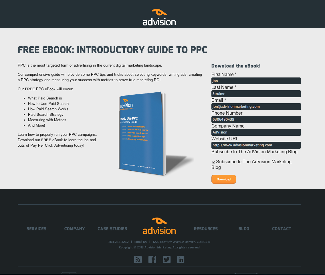
Notice how the example landing page on the right contains no navigation, and is focused on providing one thing: an eBook called the Introductory Guide to PPC. Both of these aspects contribute to higher conversion rates.
An Alluring Offer
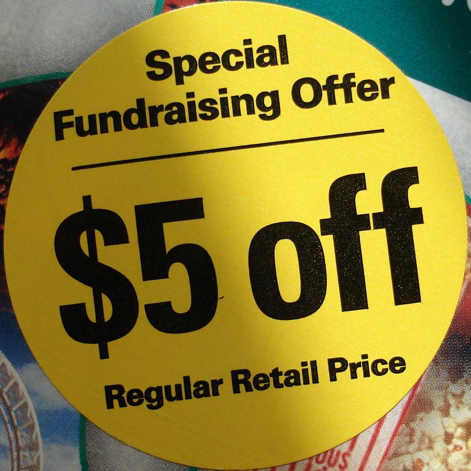
 Next, offer the customer an enticing deal. This can be a discount, a free report with sign-up or any other relevant bonus. You may wish to consider pairing any offers with a deadline; this adds a sense of urgency and makes it more likely that you visitor will act.
You can also make offers that pay off over time. Many credit cards, for instance, will pay a bonus when the client uses the card for several months. By the time the bonus is paid out, the customer is a dedicated user of the service.
Do not ask for too much information or make the reader jump through too many hoops to take advantage of your deal. The more friction between your reader and the completion of the offer, the more likely he is to abandon your page.
A Clear Call to Action
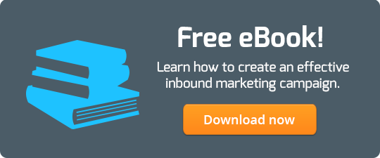
What do you want visitors to the page to do? Do you want them to buy a specific product? Sign up for a membership? In clear language, tell the reader what you want and make it easy for her to complete the action. Include an eye-catching button in the top half of the page so that completing your offer is intuitive. See the example below:

Even if there are several possible things you might want a visitor to do over time, focus on a single one to pull him down the conversion funnel. For instance, you can start by offering a free trial of one of your services. You can pitch other services later, in a confirmation email.
Always focus on your visitor's point of view and what is in it for her. Make it easy to accept your valuable offers, and you will see your traffic convert to sales.

February 26, 2014

