5 Must-Have Elements of Effective Calls to Action | Brightlark

Creating a beautiful new website is one thing, but creating a new website that “works” from a marketing standpoint is another. As marketing data nerds, we at AdVision believe a company’s website is only as good as it performs online. And by that, I mean converting as many of the hundreds or thousands of visitors you may be getting on a monthly basis into as many sales-ready leads as possible.
So, what’s the first step in doing that, you ask? Place effective “Calls to Action”, or CTAs, on your website.
Most simply put, Calls to Action are digital “mouse traps” that you can place throughout your site that urge your website visitors to take some sort of action. These calls to action can be in the form of buttons, banners, pop-ups, or even interactive elements.
Creating the best calls to action is a little bit of art meets science, and is a core compenent in any successful inbound marketing campaign. Here are some of the tactics we use to create the highest-converting calls to action possible:
1. Bait the hook.
Start here: Create an enticing offer. The most effective calls to action will offer something of value to your website’s visitors, instead of simply redirecting them to product specifications or contact information. At AdVision, we are huge fans or producing content offers such as problem-solving eBooks to “bait the hook” for potential leads, but content doesn’t always have to be the source for your enticing offers. Other offers that can be just as effective include, but are not limited to the following:
- Free consultations
- Discounts
- Referral bonuses
- Product demos
- Contests and sweepstakes
- Free tools
Additionally, if you have the time or extra hands to devote to some content development for your enticing offers, I’ve advised clients that they may very well already have usable content laying around the office. And most of the time, they had not yet realized it. Sometimes, the easiest way to develop new content to offer to your website visitors is by simply repurposing your company’s branded material. The following have worked wonders in the past:
- Case studies
- Testimonials
- Training materials
- Sales literature
- Brochure copy
2. Visually attention-grabbing design.
This is where having an in-house design team can be hugely beneficial to your marketing team. But while having a world-class graphic designer can be helpful, it is definitely not a requirement to create converting calls to action.
Have Microsoft PowerPoint on your computer? Great, you can create calls to action. No Adobe Creative Cloud subscription or other expensive software required. Simply open up a new document, layer some text over a shape, add contrasting colors, add a shadow/bevel/emboss effects, possibly add an image, and save the file as a PNG. As long as you have the ability to place this new image on your website and link it to a relevant page with an enticing offer, you’re all set!
Have a little bit of design software experience? That’s always helpful too when creating great CTAs, but still not required. Arguably, most CTA success can be attributed to placement strategies and color theories, Leaving great design as the cherry on top.
When placing a CTA on your website, always place them “above the fold”, or in the top most visible area of your screen that you see before having to scroll down the page. Always keep in mind that your website visitors will be using different sized screens and resolutions, so what you may perceive to be “above the fold” may not always be “above the fold” for your visitors.
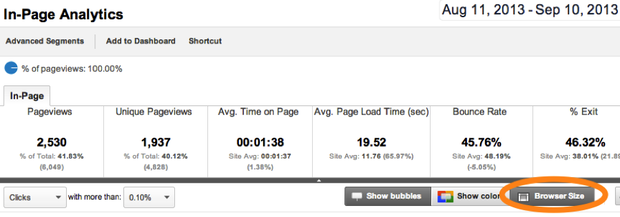
Remeber that Google Analytics isn't just for monitoring your marketing analytics; you can always check your above-the-fold placement definitively by utilizing content analytic data within your Google Analytics account. While the Audience Metrics > Technology tab will be able to tell you precisely how many users are accessing your site with each screen resolutions, In-Page Analytics can offer you some more visual insight into what your users are seeing. You can find this tool by navigating to the Content tab, selecting In-Page Analytics, and then toggling the “Browser Size” button as seen below:

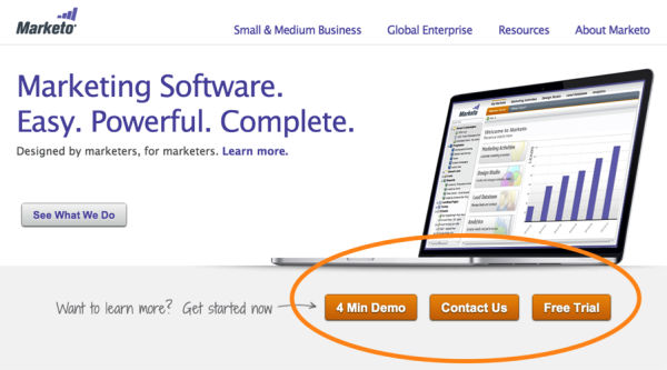
Additionally, using contrasting colors with your CTAs can help them pop off the page. For instance, if the dominant color of your website and brand is blue, you may consider adding a yellow button as a call to action. Marketo, a marketing software provider does a great job of this, as seen below:

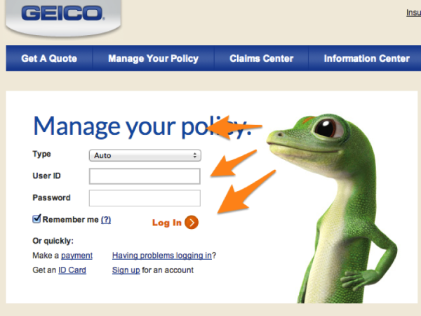
Lastly, a little trick I use when applicable is to use imagery to provide additional focus to the action element of your CTA. This can be accomplished by using people in your CTAs; purchasing a picture of a man or woman relevant to your target persona that may be staring off in one direction can be a great addition to a web banner. The direction that person may be looking can be used to guide the user’s attention to a certain website element. Although not necessarily used to affect the performance of a CTA, Geico does a great job of this on their website, as seen here:

3. Benefit and action-oriented copy.
I can definitely attest to this essential aspect of effective calls to action being frequently overlooked. Having benefit and action-oriented copy on a CTA is essential because it’s really the core messaging element of the CTA. Think about it… without using words, your job of creating a great CTA will be vastly more difficult as visuals are hard to solely rely on.
When writing copy for a CTA, always remember to convey some sort of value to the visitor. What will your visitor gain by clicking this banner advertisement? What will the user’s motivation be to take action? One great way to do this is to describe what the user will learn or take away from the eBook they are about to download. If you are offering an eBook that covers sales strategy and technique, be sure to mention on your CTA that your visitors WILL learn how to sell faster.
Action-oriented copy on buttons also can contribute to higher conversion rates. Using action words such as “Download”, “Subscribe”, or “Request Quote” not only contribute to a better user experience, but also convey what the logical next step in the online conversion process will be.
4. Consistency.
This is equally as important to pay attention to while writing your CTA’s copy…. Are you staying consistent with the offer? Nothing can anger a user more than seeing a web advertisement for a discount on a repair service, then being redirected to a page that asks for their information instead of delivering what was promised in the CTA.
This may seem like a no-brainer to some, but a lack of consistency between your CTA and your destination page not only will leave your visitors disgruntled, the bounce rate of your destination pages will be greatly affected. In case you’re unfamiliar with the term, a bounce is what happens when someone arrives at a page, views it, and immediately leaves your website domain for a better place. A bounce rate is the percentage of times this happens. A high bounce rate is bad… no one likes bounces.
5. Links to a landing page.
Yet another super important element of an effective call to action: Always, always, always link the CTA to a landing page when applicable. Using landing pages is the best way to focus a visitor’s attention on the task at hand: filling out a form to receive the given offer. This is the kind of exchange we’re always looking for. Company gives away something of value for free, and in exchange, the company receives the visitor’s information, turning that visitor into a lead.
Don’t get me wrong, linking a CTA to another portion of your site such as your blog can definitely be beneficial, but it has its time and place. When applicable, always link your CTAs to high-converting landing pages to maximize your opportunity for lead capture.
What other tactics have you used to create awesome CTAs? Are there any you don’t see here? Let us know in the comments below.

September 25, 2013