How to Create Accessible Marketing

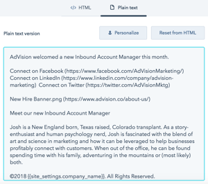
 Because emails are known to contain many different elements (text, images, CTAs, etc.), it's a great practice to familiarize yourself with VoiceOver and the Speaking Email app. These tools provide spoken descriptions of onscreen elements. Take some time to review your recent emails with these tools, and identify areas where listeners could get hung up on the intended content. Its recently become a great practice to give users the option of a plain-text email. This version makes the content easier to understand when read aloud.
Be sure to also account for screen magnifiers. Mobile users, especially, take advantage of these, so it's important that you adjust the style of your emails accordingly. Typically it's more difficult to read multiple columns within email templates, so it's recommended that you keep sections short and aligned to the left. While difficult to read on a magnified screen, center-aligned text can also be a major struggle for people with dyslexia.
Images are another area of your emails to consider. Include alternative text behind each of your visuals, to give the user context of the email and provide any valuable takeaways that they could be missing. And for those email recipients who struggle with color blindness, try to avoid using bright reds, greens and blues. Consider using other hues for your calls-to-action, and use font colors that contrast with the email background.
When it comes to the tone of your emails, keep things simple. People with hearing loss often use and interpret language differently, so it's important to use plain English and avoid overcomplicated expressions or jargon. Your message will come across more clearly to those with hearing loss or utilizing assistive technology.
Blogs
Video

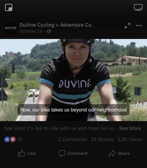
There are a lot of moving parts when it comes to video production, but there are a few small tweaks you can implement to make your videos accessible to everyone. It's become a common practice for videos to have closed captioning, so make that a priority for your project and keep the captions onscreen long enough for people to read them. On the flip side, use audio descriptions to paint a picture of what is transpiring in the video for those who are vision-impaired. Analyze the number of breaks in sound or speech in your video to determine whether standard audio description or extended audio description is needed.
Website
It's no secret that your website is your most powerful marketing tool, so it's incredibility important to make it accessible to everyone who visits. When you think about your website, user experience should be at the forefront. Make your website navigation short and easy to digest for those using VoiceOver. Thinking about your contact page, be sure to include both a phone number for your business and an email address where potential customers can reach you. If you're serious about adjusting your website, use this guide for tips and tutorials on how to make your website more welcoming to everyone.
Making a few small adjustments to how you set up your emails, website and other materials, could win you the loyalty of a large group of consumers and businesses. Instagram recently announced, to the excitement of many, new features to improve usability for those with vision impairment.

And don't be afraid to ask people with vision and hearing impairment for feedback on how you can improve your customer experience. The team at AdVision is another great resource to set you up for success across every community. Give us a call at 303-284-3262 or schedule a free inbound consultation to learn more.


December 11, 2018