How to Increase Conversions on Your Landing Page

"Don't make me think." Those four words, made famous by usability guru Steve Krug, sum up user experience at its core—and it’s the most fundamental key to successfully selling your product or service with inbound marketing. We know that a well-designed landing page should have engaging graphics or images, clean fonts that are easy to read, and pleasing colors. But aesthetics aside, making the end result as simple and pleasant as possible is the key to increasing your conversions and keeping your customers happy. Let’s look at eight strategic lessons you can implement on your landing pages for more success in conversion rates.
Embrace the White Space
It can be tempting to fill in white space, especially if you’re trying to fit lots of information into limited screen space, like when designing for mobile (which should always be your first focus).

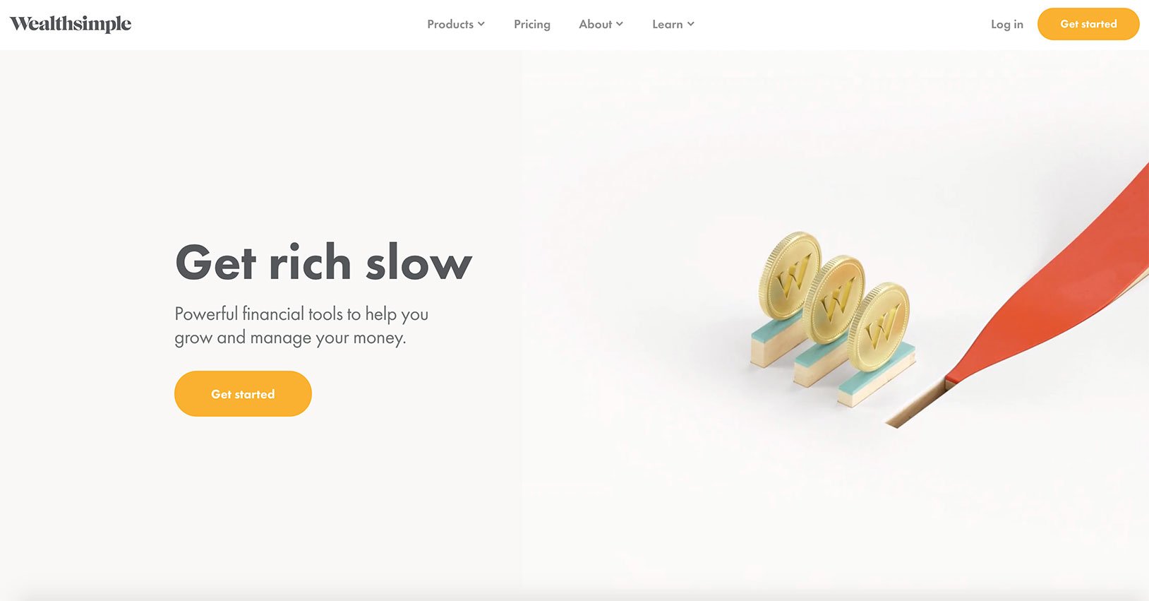
WealthSimple incorporates white space beautifully .
A combination of white space and clear, concise text communicates your bottom line much better than trying to squeeze everything into a tight space. Even if your area is limited on the screen, try to maximize your visuals and your text for impact. If it isn’t absolutely crucial to your main point, you might be better off without it. With the right amount of white space, your visitors will be able to focus more on the most important visual elements on the page, letting your headlines, key benefits, and call-to-action shine.
Design Around the End Result
We already mentioned what the user really wants: the end result. Make it clear what the user will be getting once they fill out your form, enter their email, take the next step, whatever it is – and make it clear that this end result will come to them in a timely manner. People want to get on with their lives, no matter how interested they are in your product or service. Include a short (perhaps visual) explanation of any steps included in the process if necessary.
Keep Text Light and Varied
When was the last time you genuinely read the entirety of something on the Internet? How many of us mindlessly scroll through Facebook feeds, skim headlines of articles, and only stop when something catches our eye and makes us pay attention? My guess would be a majority, especially we digital marketers whose second home is the World Wide Web.
On your landing pages, it’s instrumental to mix up pieces of text with complementary visuals, using formatting like colors, emphasis like bolding, and different sizing to keep the eye interested. Text is certainly important, however, as it gives the user valuable information. A good rule of thumb is to break up big sections of text into smaller chunks that are easy to digest – 12-15 words max. As soon as your user sees a rambling paragraph, their brain jumps to the assumption that it’s too long to read. They’ve got better things to spend time on. Keep it simple and to the point.
Show How to “Join the Crowd”
No one wants to be alone. Being part of a crowd of like-minded people is comforting. Incorporating ways of showing the user that they’ll be joining others by purchasing or signing up for what you’re offering is a proven means of increasing conversions.

Check out how Peloton incorporates social proof onto their website.
You can also add in Facebook page likes, Twitter followers or mentions, or metrics for whatever other social networks you use. Just be sure the numbers are substantial enough to impress the user—displaying small numbers might work against you.
Another good way to express social proof on your landing page is to display client testimonials, or at the very least, simple logos of clients your company works with. Adding client photos is even better.it makes the social proof that much more real. And if your product or service is truly as outstanding as you advertise on your landing page, the reviews will be stellar.
Have a Concise Purpose and Narrow Focus
When using certain marketing channels such as paid search, many people make the mistake of sending traffic directly to their site's home page. This is a mistake, since it can bog down visitors with too much extraneous information. Instead, send them to a page that you can created specifically for your current campaign.
This page should be clean and spare, with no unnecessary information, links or other clutter. Your company's history belongs on a separate "About Us" page. If you wish to collect information, keep the form short. You do not want anything that will distract the visitor from the purpose of the page.
Call Out an Alluring Offer
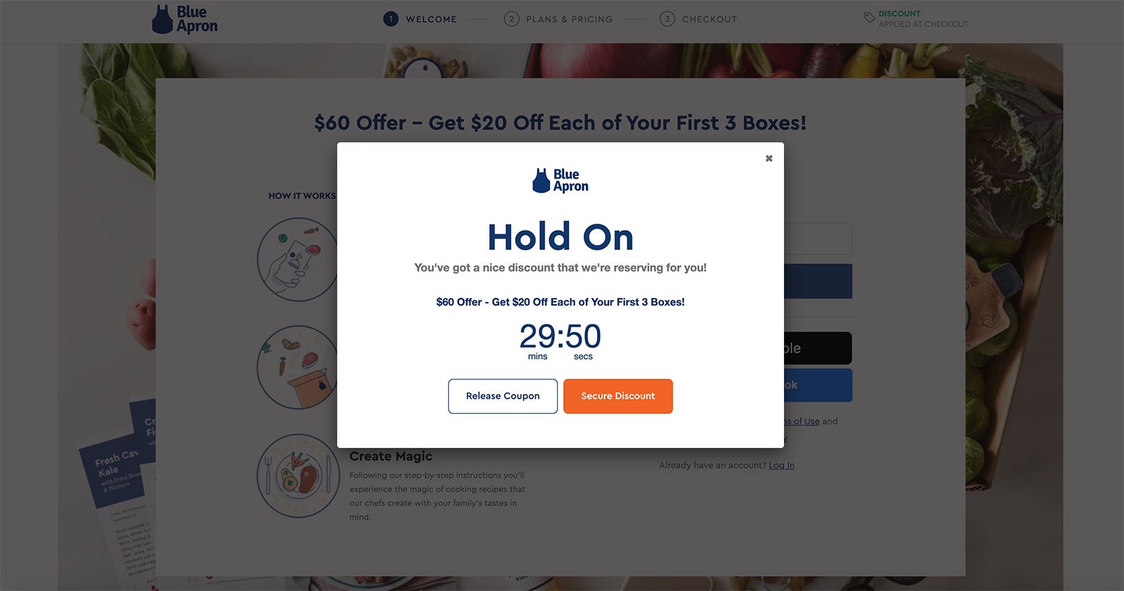
Everyone likes feeling special. This is the part where you offer the customer an enticing deal. This can be a discount, a free report with sign-up or any other relevant bonus. You may wish to consider pairing any offers with a deadline; this adds a sense of urgency and makes it more likely that you visitor will act.

One of Blue Apron's paid search campaigns demonstrates this tactic well.
You can also make offers that pay off over time. Many credit cards, for instance, will pay a bonus when the client uses the card for several months. By the time the bonus is paid out, the customer is a dedicated user of the service.
There's no need to ask for too much information or make the reader jump through too many hoops to take advantage of your deal. The more friction between your reader and the completion of the offer, the more likely she is to abandon your page.
Make Your Call to Action Clear
What do you want visitor to do? Do you want them to buy a specific product? Sign up for a membership? In clear language, tell the reader what you want and make it easy for her to complete the action. Include an eye-catching button in the top half of the page so that completing your offer is intuitive. See the example below:
Even if there are several possible things you might want a visitor to do over time, focus on a single one to pull him down the conversion funnel. For instance, you can start by offering a free trial of one of your services. You can pitch other services later, in a confirmation email.
Always focus on your visitor's point of view and what is in it for her. Make it easy to accept your valuable offers, and you will see your traffic convert to sales.
Use Valuable Above-the-Fold Real Estate
Your user will form a decision as soon as they land on your page. Thus, the most valuable area is what the user sees right away. But does this mean that your CTA should go above the fold, as many landing page best practices suggest?
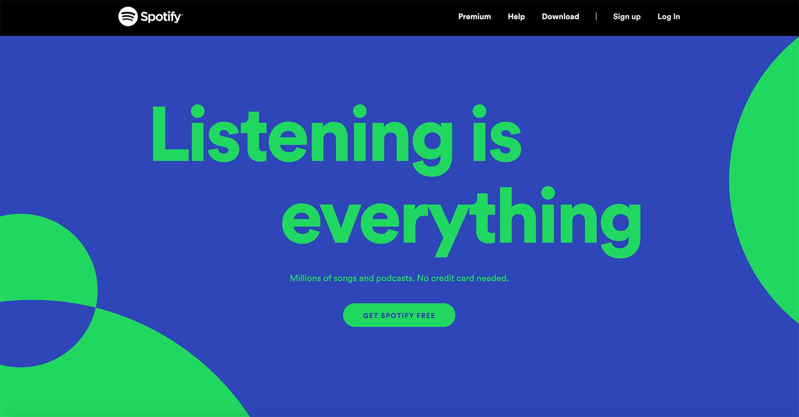
Not necessarily. Recent studies have suggested that placing your CTA above the fold really doesn’t affect conversion rate one way or the other. It completely depends on what you’re offering. For instance, Spotify’s product is well known and straightforward, so they’re completely fine putting the CTA above the fold.

Site: www.spotify.com
But if your product or service takes a bit more explanation to answer the question “what am I getting out of this?” – you might be better off using that valuable above-the-fold space to give more context rather than asking the user to commit right off the bat.
Basically, whatever you put above the fold, just make sure that it entices the visitor. When you grab the user’s attention right off the bat, they’re much more apt to scroll down and learn more about your product or service. More time spent on a landing page typically means more interest, which typically means… you guessed it, more conversions.
Make Your Page Familiar
As humans, we are attracted to the familiar. Remember when you learned about the mere-exposure effect in your college psych class? People prefer things that they’ve been exposed to before, from faces to words to shapes to songs. Seeing and hearing familiar things create a “glow of warmth.” The UX lesson here: design your landing page simply and intuitively, using the tried-and-true elements of web design. You don’t want the user to have to spend time figuring out how to navigate your landing page – use a layout that’s already familiar to the user. Structure your landing page cleanly and logically, incorporating some visual breaks to prevent repetitiveness.
Lessons Learned
Each landing page is different, so don’t assume that these are by any means “best practices” or applicable to every industry. Test what works best for your business or product, and learn your audience. As a user, I will most likely be interested in something placed behind a beautiful, clean, straightforward landing page. As long as you don’t make me think.

September 25, 2020