Website Design Features to Improve Conversion Rate

Getting people to your website is one thing, keeping them there is another story. With the average website visitor remaining onsite for 15 seconds, you have a very short window of time to capture their attention and direct them on a path to conversion. To get a better understanding of your visitor engagement, and to help identify areas for improvement, utilize tools like Google Analytics. Your bounce rate will indicate whether your users are finding what they need out of your website and your average session duration will tell you what pages guests find most engaging.
The amount of time a user spends on your website is a clear indication of the value they receive. Below are a few recommendations to implement on your site that combat a visitors urge to leave:
Make Important Info Stand Out
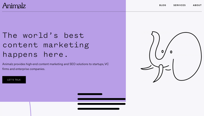
When someone lands on your website, it's important that they immediately understand what you're offering. Studies have shown that visitors spend 2.6 seconds scanning a website before focusing on a particular section. Make good use of the space above the fold by including bold headers and bulleted lists to make it easier for people to identify key components of the website. Inbound links are another great way to highlight important keywords and phrases. They also help people to better navigate your site.

Focus on Readability
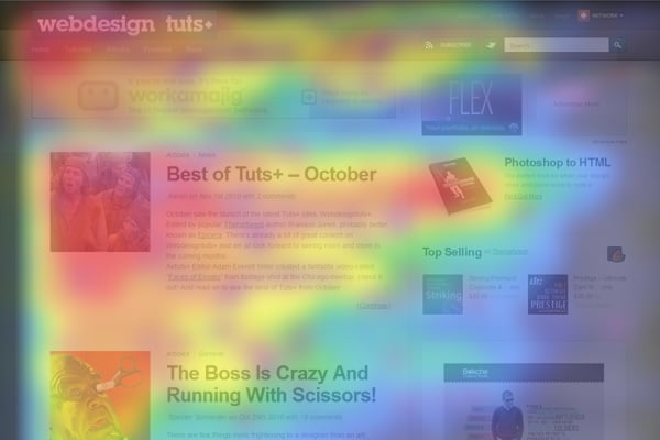
Because users only read 28% of the words on an average visit to a website, it's important that your web pages are set up to be scanned quickly. Expects will tell you that creating a design around the common F-pattern (seen below), is key to keeping people on the page longer. Visitors will typically start at the top of the page and scan the navigation. From there, they'll move down, taking in less information from the right side of the page. As you revamp website pages, utilize the F-pattern in a subtle way (a strict design can look predictable and outdated).

Eliminate the Jargon
Utilizing jargon — think "actionable" or "transparent" — to explain your product or service isn't doing you any favors. When your pages lack specificity and common language, visitors feel lost. They're also quick to pick up on BS. Review your pages to identify overused phrases and words, and replace them with strong, clear words that get to the point and tell visitors what you actually offer. You can also utilize tools like Unbounce's Dejargonator or the Jargon Grader, to scan your web pages, looking for words or expressions that can be replaced for better readability.
Choose Images Wisely
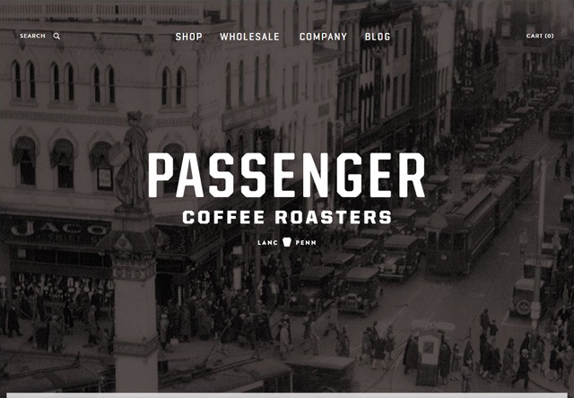
Images and video are the most engaging content online. Because photos are so appealing, more and more businesses are utilizing images for the background of their homepage or landing pages. Make sure that the images you've included on your web pages are interesting and high resolution. Check out quality royalty-free stock image sites like Pexels or Unsplash to find great imagery for your site.

Up Your Credibility
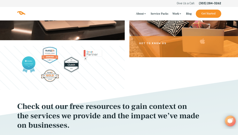
Adding trust marks, like badges, awards, certifications or publications, gives visitors confidence to do business with your company. Because people recognize and remember images more easily, badges are the most influential first impression.
On the same note, real photos of your team and products also make brands appear trustworthy. Consider including a team page on your site, with bios that further detail who is behind the business. Because every interaction is an opportunity to build trust with a potential customer or client, it's important to lead with these website components that instill trust.

Include Engaging Content
One of the most effective ways to provide value to a website visitor is through quality content. Whether it's web page content, blogs or content offers, you can capture user attention through well-curated subject matter. Dig into the demographics of your target audience and create a content strategy that inspires your audience to take action.
Target Exiters
Like death and taxes, visitors leaving your site is inevitable. However, you can still work to convert visitors on exit intent. Many marketing platforms offer exit intent software with customizable pop-up forms. Through targeting abandoning visitors, you'll likely see an increase on returning visits and a decrease to your site's bounce rate.
Looking to improve the functionality of your website? Contact us for a SEO Analysis. We'll identify pages where people are exiting at a high rate and put together a plan to improve the your overall website conversion rate.

October 3, 2019
